Background
A big airport authority was about to start recruiting for multiple positions.
A dashboard was needed to help assessors evaluate the candidates
on the basis of 3 major assessments:
Technical
Leadership
Psychometric
Provide enhanced insights and analytics into the recruitment
process, empowering better decision-making with real-time data?
By streamlining repetitive administrative tasks, we can save time for assessors, enabling them to focus more on critical evaluations and less on manual work.
How Might We?
The Solution
I tried to answer the following questions with my research:
1. Who are we designing for?
- Assessors
2. What features & functionalities are essential?
- Data visualisation, Report generation, Time efficient system
3. What kind of dashboard designs are successful IRL?
- I checked Leapt Code, PWC, Smart Recruiters
4. Are there any existing design guidelines? brand identity?
- Riyadh Airport Authority
5. Is the task challenging and fun to do?
- YES!
Research
Define
The Problem
Currently, the assessors use MS Excel and MS Word to assess, score and manage candidate data.
Although, MS Excel and Word are familiar tools, which can handle large sets of data with formulas, pivot tables, and filters for calculations and sorting.
There are a few disadvantages, according to the users (assessors):
It Lacks centralised storage for candidate records, making it hard to search or filter data quickly
Requires manual integration between Excel (for scores) and Word (for candidate reports)
Time-intensive to manage and keep data accurate across multiple files

User Insights
One user said:
“I spend hours consolidating scores manually—an automated solution would save so much time.”
Assessors struggle with managing multiple files, leading to delays in evaluations.
Need for better visualization of data to quickly assess candidate performance across technical, leadership, and psychometric areas.
Understanding
Business Goals
Every UX process starts with aligning with the stakeholders to realise the goals and motivation behind the product. Iterating towards the solutions is a non-linear process with constant feedback from other team members, developers and end users.
Data Insights
Better Decision Making
Save Time
Design
After clearly defining the problem that needs to be solved, we started
brainstorming for tangible solutions.

Information
Architecture
Outlining the relationships between different pages and content areas, helping designers, developers, and stakeholders understand the organisation of the site.
Ensures logical content flow
Helps plan intuitive navigation and user experience
Challenges Faced

For each assessment, there are multiple competencies.
For each competency, there are multiple questions.
And for each question, there are multiple
supporting details.
Challenge 2
Too Much Navigation
Deciding which data should be visible on Home Screen.
As this is the first thing a the user will see after login, it is very crucial to use the space accurately and only show the most important data
Challenge 1
Presenting Important Data
My Process
Research
Define
Design
Deliver

Finding Solutions
To tackle the first challenge, I asked the end users and stakeholders:
What is the most important data, that needs to be visible
on the home screen?
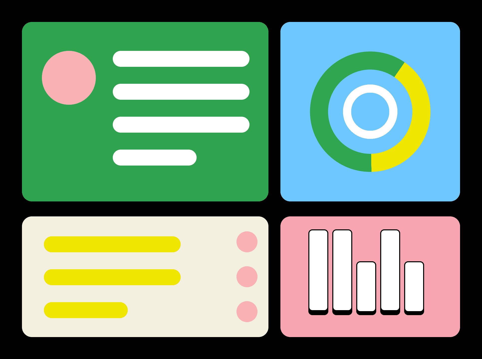
Total Candidates
Assessment Overview
Questionnaire Download
My Tasks
Calendar
Challenge 1
To tackle the second challenge, multiple iterations were created
Using UX Laws, we decided to go with the option that provides:
Less Cognitive Load
Better Visual Hierarchy
Reduce Sidebar Clutter

Challenge 2
With Fewer clicks and cleaner layout, users can focus more on their task and less on navigating.
Wireframes
Wireframing played a crucial role in shaping the foundation of this design. By creating low-fidelity wireframes early in the process, we were able to establish a clear structure and user flow before introducing visual elements.

This helped align stakeholders on functionality, ensuring that every interaction was intuitive and user-centric. Additionally, wireframes facilitated quick iterations and usability testing, allowing us to identify pain points and refine the experience before moving into high-fidelity designs. This approach not only streamlined development but also ensured a seamless and user-friendly final product.


In the visual design phase of the dashboard, we focused on refining the wireframes by integrating a structured colour palette, clear typography, and an intuitive layout by keeping the Brand Guidelines in mind. By adhering to a well-defined design system, we maintained consistency across all elements, improving readability and interaction


Visual Design


Thank You!
Key Insights
80%
User Satisfaction
65%
Decision Making Speed
Improved Data Visualization & User Efficiency
Optimized data visualization for the recruitment dashboard
Achieved 80% user satisfation by improving decision-making workflows through thoughtful UX enhancements
Prototype Video
Recruitment Dashboard
