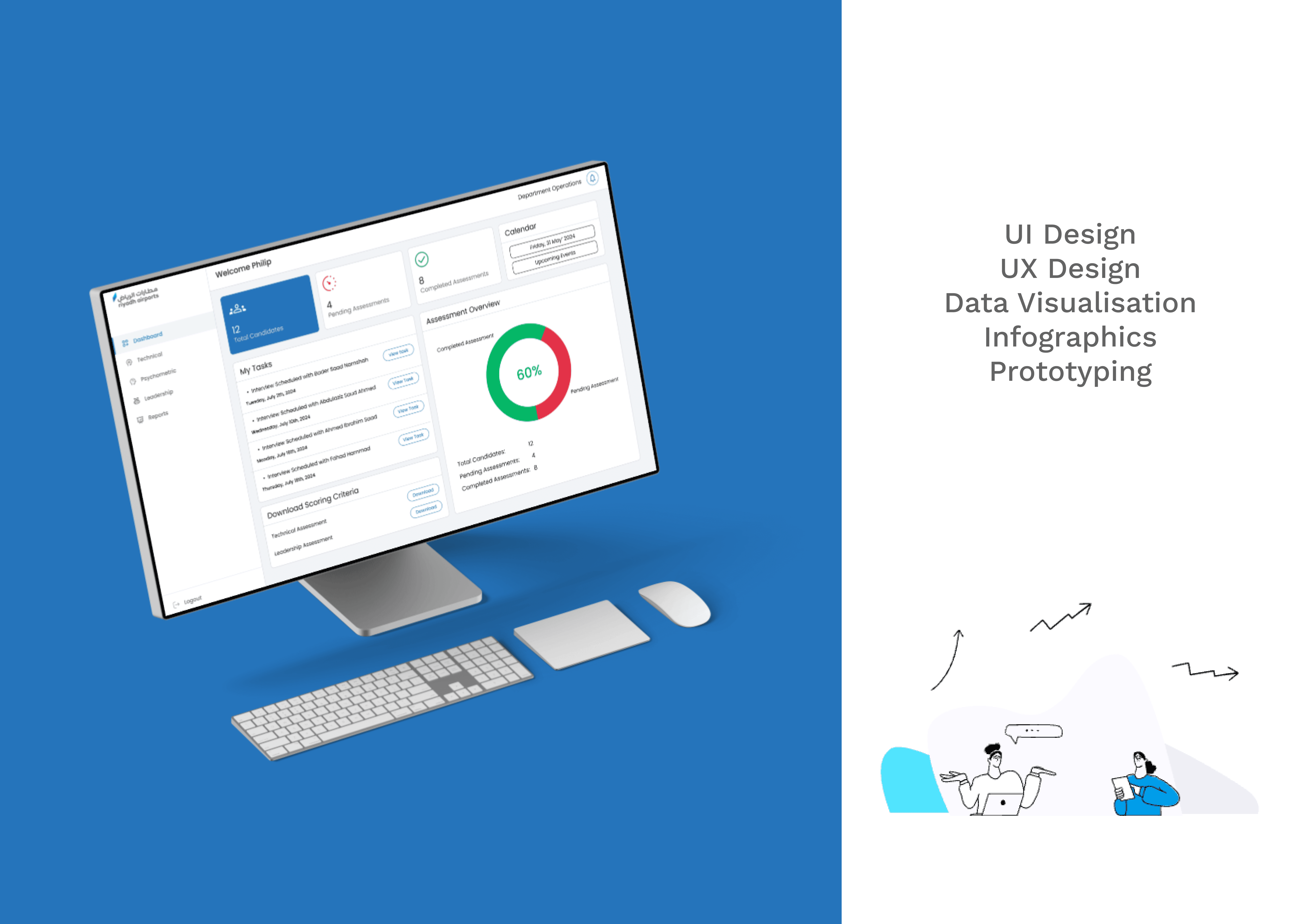
01 — Context
Riyadh Airport was preparing for large-scale hiring, where every candidate had to be evaluated across technical, leadership, and psychometric assessments, with multiple competencies in each. The challenge: Design a dashboard that gives assessors everything they need to make faster and more confident hiring decisions.
02 — Process
03 — Research
Validating user workflow
We began by understanding how assessors currently evaluate candidates.
Through stakeholder discussions, workflow analysis, and competitor benchmarking, mapping user journey pain points emerged around fragmented data, manual reporting, and the lack of actionable insights.
These findings shaped the dashboard before a single interface was designed.
In Their Own Words
"Managing candidate data across multiple files slows down every evaluation."
"I need all assessment files in one place before I can confidently make a decision."
"Generating reports manually takes too much time, I want more insights, not paperwork."
Stakeholder Discussions · Workflow Analysis · Finding Pain Points
Research Insights
01
Fragmented Information
Candidate data is scattered across Excel sheets, Word reports, and assessment files,
making it difficult to access everything in one place.
02
Limited Decision Support
Assessors lack a consolidated view of technical, leadership, and psychometric performance,
making comparisons slower and less confident.
03
High Manual Effort
Generating reports, calculating scores, and preparing evaluation summaries require repetitive manual work, increasing the chances of delays and errors.
Design Opportunity
How might we centralize candidate information and surface meaningful insights that reduce manual effort while enabling faster, more confident hiring decisions?
04 — Problem
Problem
Assessors relied on Microsoft Excel and Word to evaluate candidates, requiring manual data entry, fragmented record management, and report generation across multiple files.
This made recruitment workflows slow, error-prone, and difficult to scale.
Constraints
Existing workflows depended on familiar Microsoft Office tools and large datasets, making it essential to improve efficiency without disrupting the assessment process or compromising data accuracy.

How Might We
Centralize candidate assessments and automate repetitive workflows to provide real-time recruitment insights, enabling faster, more informed hiring decisions while reducing administrative effort?
05 — Ideation
From Insights to Product Direction
Rather than jumping straight to high-fidelity screens, I first mapped out how information should be organised — what assessors need to see, in what order, and at what level of detail.
Information Architecture

Challenges Faced
Challenge 1
Information Prioritization
The home screen displayed a large volume of information, making it difficult to identify what mattered most. The challenge was to prioritize content without sacrificing context.
Challenge 2
Reducing Navigation Complexity
The assessment structure spanned multiple nested levels, increasing navigation effort. Users needed a simpler path to access detailed information quickly.
06 — Solution
Feature-by-Feature
Detailed Walkthrough

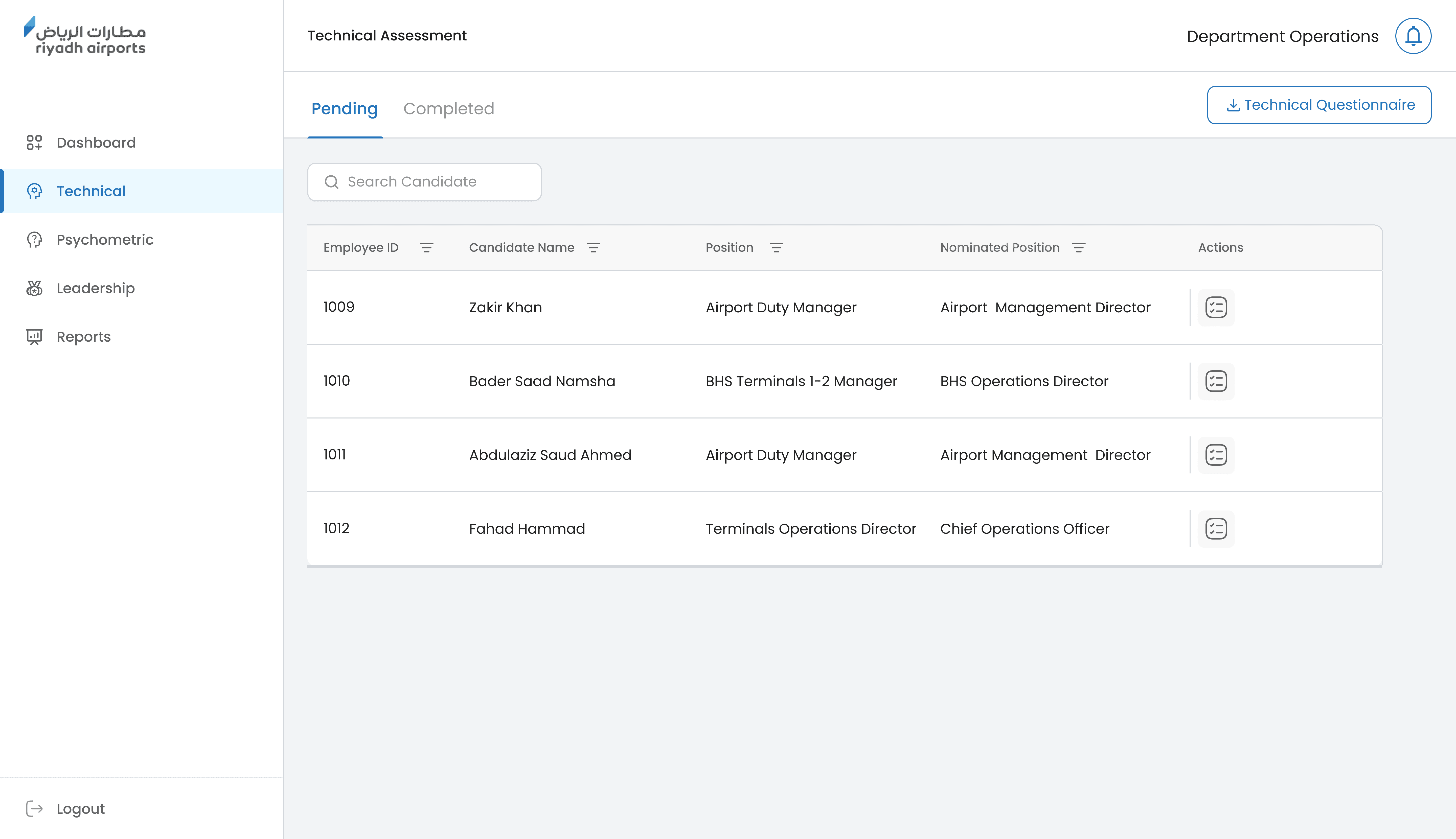


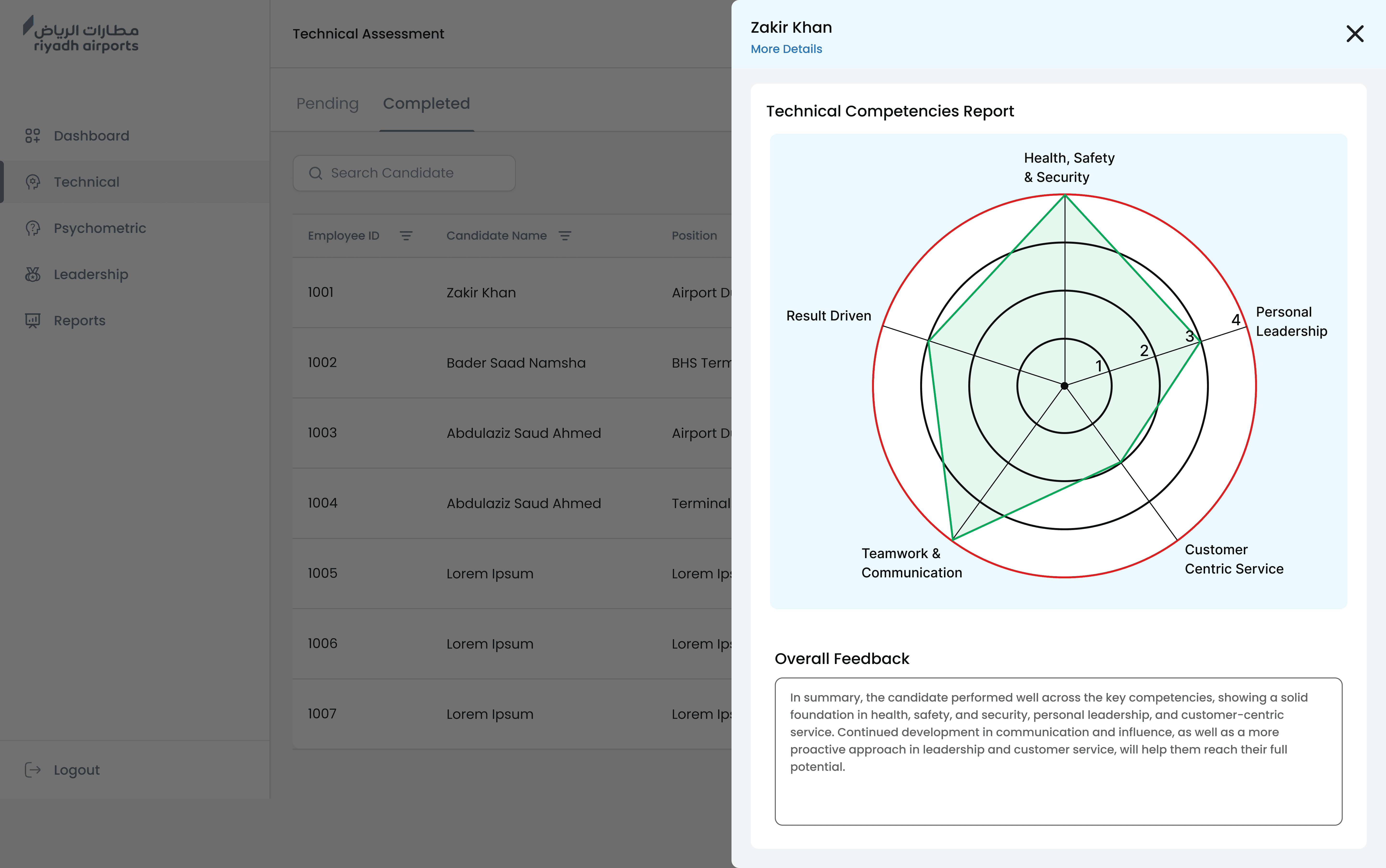
Slide One Title
First pointShort supporting sentence for this point.
Second pointAnother short supporting sentence.
Third pointOne more supporting sentence.
07 — Impact
Faster Decisions, Off the Spreadsheet
08 · Reflection
the biggest lesson
wasn't about
interface.
Designed for confidence.
I learned that enterprise UX isn't about removing complexity, it's about presenting the right information at the right moment to support confident decisions.
Reducing uncertainty.
Designing around user friction and decision points had a greater impact than simply improving the visual interface.
Validated assumptions through research.
Journey mapping, usability testing, and AI-Powered rapid prototyping helped replace assumptions with evidence, leading to more effective solutions.
Balanced business and user needs.
Collaborating with stakeholders and engineering reinforced the importance of aligning user experience with operational goals and technical constraints.
Built for long-term adaptability.
The project highlighted that enterprise products constantly evolve, making scalable workflows and reusable design patterns essential for future growth.